Bordering on the impossible
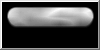
The border is going to be made with a series of Steps which once mixed together will make this rounded rectangle with blurred edges:

Each side is made using a Stepped Gradient:
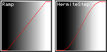
These images show the two steps used create different gradients in the tutorial: Hermite being smoother where the gradient starts and ends, and having a steeper slope (it is also three multiplies slower, but that is usually negligible).
To make the top border, a Hermite step will work on the y value.
The step will start rising immediately (the step-start parameter is zero) and reach its maximum at 2*BorderWidth as you can see in the following image and code:

y is zero at the top of the image and steps start at zero which is black, so at y==0 (the top) the step is black.
For pixels with y>2*BorderWidth, the step will return 1.0 (white).
vTop will be an Unsigned Interval [0,1] so to get to a greyscale level vTop is simply multiplied by 255 to set the pixel.
WORD BorderWidth=8;
double DblBorderWidth=2*BorderWidth;
for(WORD x=GetWidth(); x--; ) {
for(WORD y=GetHeight(); y--;) {
double vTop=gFilters::HermiteStep(y, 0, DblBorderWidth);
BYTE B=BYTE(Round(255*vTop));
SetPixel(x,y, RGB(B,B,B));
} }
GetWidth(), GetHeight() and SetPixel are members of CPixelBlock which was used as a base class.
Round is declared in Global.h.
If you are familiar with CPixelBlock, SetLevel would have been more appropriate for this greyscale image, but is less appropriate for a general tutorial.
To mix in the bottom border, all that is required is a step in the opposite direction.
Steps rise from black to white, so the reverse is required to mirror the top; (1-Step) is used to create a photographic negative of the step.
This (1-UnsignedParameter) to flip the image will happen a lot.
The mix is a simple multiplication because the results of both steps are numbers in the range [0,1] which, when multiplied can only result in another number in the same range.
The two features of multiplication that are being used are that where either step was zero, the result will be zero: so the black parts stay black;
and where either step returns one, the other step's value is all that matters. This is the code for the bottom Step:
double vBorder=vTop*(1-gFilters::HermiteStep(y, GetHeight()-DblBorderWidth, GetHeight()));
and this is the result of the Mix:

Crossing the Borders
Having made the Top and Bottom, the sides will be easy: the same code but using x and GetWidth().

Here is the code covered so far, with the sides created in the x loop, and mixed with the top and bottom using a multiply:
WORD BorderWidth=8;
double DblBorderWidth=2*BorderWidth;
for(WORD x=GetWidth(); x--; ) {
double uBorder=gFilters::HermiteStep(x, 0, DblBorderWidth)
*(1-gFilters::HermiteStep(x, GetWidth()-DblBorderWidth, GetWidth()));
for(WORD y=GetHeight(); y--;) {
double vTop=gFilters::HermiteStep(y, 0, DblBorderWidth);
double vBorder=vTop*(1-gFilters::HermiteStep(y, GetHeight()-DblBorderWidth, GetHeight()));
double Border=uBorder*vBorder;
BYTE B=BYTE(Round(255*Border));
SetPixel(x,y, RGB(B,B,B));
} }
This code will be added to, throughout the tutorial.
Take a moment to get used to the idea that the various images getting mixed together are, in code, an Unsigned Interval being manipulated by a series of functions that represents the greyscale level of a single pixel.
Debugging is easy
Notice the bold word in each code section: that is where you say what you want to see.
In the last code section it will draw the Border:
but if you wanted to see what the sides looked like on their own, simply replace the "255*Border" with "255*uBorder", "255*vBorder" to see the top and bottom together, or "255*vTop" to see just the top again.
You can, of course, make make things look a little more 'optimised' and just use one or two parameters throughout;
it seems little different (you just comment out later lines) but the compiler should be optimising the assignments, and if sensible variable names are used, the code is easier to maintain with a new variable on each line.
Breaching the Threshold
This border is a negative of the first part of the Photoshop Glass Button Tutorial:
a white button on a black background has been made, but the Photoshop tutorial creates a black button on a white background and doesn't blur the outline until later.
Blurred shapes are actually very useful starting places in procedural programming: you can select a part of the blurred region to become the whole image using one of the Step functions.
This was first demonstrated on the Textures page.
The blur will be separated into different shapes: one inner, one outer and a rounded rectangle.
The Photoshop Tutorial uses Drop Shadow to add outer blur. The next step for this code will be a Hermite one:
double Outer=1-gFilters::HermiteStep(Border, 0, 0.5);
The Step Function works on the previous image (called Border), keeps only the dark half of the original blur (the outer blur) and spreads it to full range:

After the Step, the "1-" will mean that Outer will be a black button on a white background:

This blur is deliberately blacker and thicker than the Photoshop Tutorial; the end of this tutorial will show how to change it.
To add a linear gradient to the black background, another Step is used, which will change with the value of y between the top and bottom borders:
if(Outer==0) Outer=0.5*(1-gFilters::Ramp(y, BorderWidth, GetHeight()-BorderWidth));
Again the "1-" is making a negative (the ramp would be dark at the top, but needs to be dark at the bottom),
and the "0.5*" is halving the gradient's brightness.

The ugly region between the gradient and the blur will be dealt with later.
Inner Glow
The inner glow can be taken from the origninal Border blur:
This time, the Step is a Ramp, taking the white half of the Border image (the inner blur):

double Inner=gFilters::Ramp(Border, 0.5, 1);
Mixing this Inner with Outer will result in the first Button-shape.
Different mixing methods will produce different looks, providing a chance to add code to draw the Button differently if it is up or down:
Here are a few example mixes:
double Button=gColor::Blend(1-Inner,0.4,Outer,0.6);
double Button=(Inner>0 ? Inner*Outer : Outer);
double Button=(Inner>0 ? (2-Inner)*Outer : Outer);
double Button=gColor::Lighter(1-Inner,0.5,Outer);
double Button=(Inner>0 ? 1-Inner*Outer : Outer);
double Button=(Inner>0 ? (1-Inner)*Outer : Outer);
Notice that the last ones are destructive! They change the inner gradient that was put in.
When changing the mix it is important to be looking at the mix itself and not the end product, to identify small changes like this.
These destructive mixes are not always bad though: in this example the Button has different states, so the Down image may look more 'down' if it has less gradient, and the highlighted version may look better with a brightened gradient.
The following line of code will render the button without a gradient when it is down, and with the gradient and inner glow on the upper borders when the button is up:
double Button=(Inner>0 ? ((Down ? 1 : 2)-Inner)*Outer : Outer);
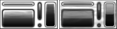
This is Button when Down is false:

This is Button when Down is true:

Rather than completely losing the gradient, the "1" could be "1.5" when Down is true.
The artefacts around the gradient will be removed in the next section, but first, a review of the code so far:
bool Down=false;
WORD BorderWidth=8;
double DblBorderWidth=2*BorderWidth;
for(WORD x=GetWidth(); x--; ) {
double uBorder=gFilters::HermiteStep(x, 0, DblBorderWidth)
*(1-gFilters::HermiteStep(x, GetWidth()-DblBorderWidth, GetWidth()));
for(WORD y=GetHeight(); y--;) {
double vTop=gFilters::HermiteStep(y, 0, DblBorderWidth);
double vBorder=vTop*(1-gFilters::HermiteStep(y, GetHeight()-DblBorderWidth, GetHeight()));
double Border=uBorder*vBorder;
double Outer=1-gFilters::HermiteStep(Border, 0, 0.5);
if(Outer==0) Outer=0.5*(1-gFilters::Ramp(y, BorderWidth, GetHeight()-BorderWidth));
double Inner=gFilters::Ramp(Border, 0.5, 1);
double Button=(Inner>0 ? ((Down ? 1.5 : 2)-Inner)*Outer : Outer);
BYTE B=BYTE(Round(255*Button));
SetPixel(x,y, RGB(B,B,B));
} }
Hide or Highlight
This is a particularly good example of using Steps to pick what you want from a blurred image.
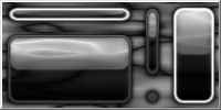
The original blurred border:
is going to be used again to extract a rounded rectangle which can hide the ugly artefacts generated earlier, and optionally highlight the button.
bool Highlight=true;
double Line=gFilters::Ramp(Border, 0.3, 0.5)
*(1-gFilters::Ramp(Border, 0.5, 0.7));
Button=Button*(1-Line)+(Highlight ? Line : Line/3);
To do this, the first Step (a Ramp) is given the Border parameter and told to give back the section between 0.3 and 0.5; anything below 0.3 will be black,
anything above 0.5 will be white and everything within those numbers will be linearly fitted to the range [0,1] giving an antialiased white rounded rectangle on a black background.

This is mixed using multiplication (like the sides were) with the negative of a similar Ramp which is sampling Border between 0.5 and 0.7;
The negative will result in an antialiased, black rounded rectangle on a white background, which will be a little smaller than the first one.
When the two rounded rectangles are mixed, the result is an antialiased white rounded rectangle.
If particularly smooth antialiasing was required, use HermiteStep, but here it doesn't matter and Ramp is a little faster.
If you are familiar with gColor Mixers, the last line of the previous code section is equivalent to:
Button=gColor::Add(1-Line, Button, (Highlight ? Line : Line/3));
It is worth understanding both ways of thinking; the former is a lower-level number-crunching way of thinking, the latter is a higher-level 'Filtering Parameters' way of thinking.
The resulting image was created to hide the artefacts generated earlier, but looks great as illumination for the button, so the Button can be given a Highlight property and drawn differently when Highlighted.

Time for Text?
With the button bases drawn, it would normally be time to add the text, then finish with the glassy reflection over the top...

However, although the button can be drawn, all that is available is a Parameter: not an image.
It is possible to stop now, draw text, then go over the whole image again to add the reflection, but that isn't necessary.
The text can be added after the reflection if a sensible mixing method is used.
Since adding text procedurally would be challenging, this tutorial will finish the button with a reflection and expect the text to be blended later.
Seeing the Light
To create a reflection, something like the original Button background is needed, but only as across the top half.
The previously created Parameters, vTop and uBorder can be used again for top and sides, so a bottom is all that is needed:

The reflection should move a little when the button is pressed down, so a variable will be used to store the bottom of the reflection.
WORD Middle=GetHeight()/2;
WORD ReflectionBottom=Middle+(Down ? BorderWidth/2 : BorderWidth);
double Reflection=(1-gFilters::HermiteStep(y, Middle-BorderWidth, ReflectionBottom));
Reflection*=vTop*uBorder;
This gives a blurred shape that we can extract an antialiased rounded rectangle from, using a Step Threshold:

Here's the Threshold:
Reflection=gFilters::Ramp(Reflection, 0.3, 0.5);
and the resulting shape:

The Photoshop Tutorial has a gradient up the reflection, which can be added with a Ramp working on y:
Reflection*=(1-0.75*gFilters::Ramp(y, BorderWidth, ReflectionBottom));
The gradient is mixed in with a multiply (so black areas won't be effected) and since the Ramp gradient is the wrong way round, the "1-" inverts it so black is at the bottom.
To move the reflection a little when the button is down, the gradient can be made steeper with a HermiteCurve: just throw the Reflection Parameter through it:
if(Down) Reflection=gFilters::HermiteCurve(Reflection);
Which version looks most like the Button is 'up' or 'down' depends on the rest of the drawing:

What matters is that there are now two different reflections to choose from.
For a more subtle reflection, change or remove the "0.75*" before the Ramp:

or draw the Highlight after the rectangle to cover the bright top:

Clearly, drawing the line before or after the relection could also be used to help make the Button look 'Up' or 'Down'.
Reflecting... something
One of the joys of Procedural Texturing is Coherent Noise.
The fastest simplest noise function will create the illusion that 'something' is being reflected, in this case, by smearing the reflection gradient:
The animation shows both Reflection gradients but is it worth pointing out that the gradient could be added after the noise.
Reflection*=1-fabs(Noise::InterpolatedNoise(x/20.0, y/4.0));
Button=gColor::Screen(Reflection,0.9, Button,0.1);
If you redraw your buttons when they move (or when the whole application window is moved) you can redraw the noise relative to the screen
to make the reflection look even more real (as the button moves, the reflection patterns stay where they are on the screen):
Reflection*=1-fabs(Noise::InterpolatedNoise((WindowOrigin.x+x)/20.0, (WindowOrigin.y+y)/4.0));
Experimenting with mixing can often come up with interesting effects and improvements such as mixing the noise in with the Reflection and the Button all in one go like this:
Button=gColor::Overlay(gFilters::RootCurve(1-fabs(Noise::InterpolatedNoise(x/20.0, y/4.0))), Reflection, Button, 1-Reflection);
Pressing On
Here are the results, one image of each state of the finished Button:


A marbled or dirty surface can be created with this:
Button=gColor::Difference(gFilters::RootCurve(1-fabs(Noise::InterpolatedNoise(x/20.0, y/4.0))), Button, Reflection, 1-Button);
Previous steps would need tweaking if this was the intended target, but here's the a glimpse of the result:

Here are the normal and marbled versions for comparison; showing how the noise spreads between buttons on the marbled background:
Remove the "1-" for a heavily marbled background (and more work needed on the foreground)!
Here's the code used to draw the above Button Sets:
  Button(CRect(  0, 0,125, 25), false,  true, 8, Normal);
  Button(CRect(125, 0,150, 75),  true, false, 8, Normal);
  Button(CRect(  0,25,125,100), false, false, 8, Normal);
  Button(CRect(125,75,150,100), false, false, 8, Normal);
  Button(CRect(150, 0,200,100),  true,  true, 8, Normal);
and for the whole Button-drawing method (assumed to be in a class derived from CPixelBlock):
enum FinishType {Normal,Clean,Marbled};
void Button(WORD Left, WORD Top, WORD Width, WORD Height, bool Down=false, bool Highlight=false, WORD BorderWidth=8, FinishType Finish=Normal) {
ASSERT(Width >=BorderWidth);
ASSERT(Height>=BorderWidth);
WORD Middle=Height/2;
WORD ReflectionBottom=Middle+(Down ? BorderWidth/2 : BorderWidth);
double DblBorderWidth=2*BorderWidth;
for(WORD x=Width; x--; ) {
double uBorder=gFilters::HermiteStep(x, 0, DblBorderWidth)
*(1-gFilters::HermiteStep(x, Width-DblBorderWidth, Width));
for(WORD y=Height; y--;) {
double vTop=gFilters::HermiteStep(y, 0, DblBorderWidth);
double vBorder=vTop*(1-gFilters::HermiteStep(y, Height-DblBorderWidth, Height));
double Border=uBorder*vBorder;
double Outer=1-gFilters::HermiteStep(Border, 0, 0.5);
if(Outer==0) Outer=0.5*(1-gFilters::Ramp(y, BorderWidth, Height-BorderWidth));
double Inner=gFilters::Ramp(Border, 0.5, 1); // Thresholding the Inner Blur
double Button=(Inner>0 ? ((Down ? 1.5 : 2)-Inner)*Outer : Outer);
double Reflection=(1-gFilters::Ramp(y, Middle-BorderWidth, ReflectionBottom));
Reflection*=vTop*uBorder; // Mix in the top and sides
Reflection=gFilters::Ramp(Reflection, 0.3, 0.5);
Reflection*=(1-0.75*gFilters::Ramp(y, BorderWidth, ReflectionBottom));
if(!Down) Reflection=gFilters::HermiteCurve(Reflection);
switch(Finish) {
case Clean: Button=gColor::Screen(Reflection,0.9, Button,0.1); break;
case Marbled: Button=gColor::Difference(1-fabs(Noise::InterpolatedNoise((Left+x)/20.0, (Top+y)/4.0)), Button, Reflection, 1-Button); break;
default: Button=gColor::Overlay (1-fabs(Noise::InterpolatedNoise((Left+x)/20.0, (Top+y)/4.0)), Reflection, Button, 1-Reflection); break;
}
double Line=gFilters::Ramp(Border, 0.3, 0.5)
*(1-gFilters::Ramp(Border, 0.5, 0.7));
Button=gColor::Add(1-Line, Button, (Highlight ? Line : Line/3));
BYTE b=BYTE(Round(255*Button));
SetPixel(Left+x, Top+y, RGB(b,b,b));
} }
}
Enhancements
Whilst the above code creates interesting Buttons, it differs from the initial target:

The black blurred border should be more like the Photoshop version, which gives the opportunity to demonstrate the use of filters over the whole image within the construction (no second pass needed).
The contrast of the whole image can be increased by throwing Button through a HermiteCurve immediately before rendering:
Button=gFilters::gFilters::HermiteCurve(Button);
BYTE b=BYTE(Round(255*Button));
SetPixel(Left+x, Top+y, RGB(b,b,b));
A Gain Filter gives more control with a parameter (but is much slower):
Button=gFilters::Gain(Button,0.75);
BYTE b=BYTE(Round(255*Button));
SetPixel(Left+x, Top+y, RGB(b,b,b));
This image shows the blurry normal Button followed by the HermiteCurved version, then the Gain at 0.75 which is the sharpest image:

If only the outer blur is to be altered, throwing the HermiteStep (that creates 'Outer') through a HermiteCurve will lessen the outer blur without effecting the rest of the image:
double Outer=gFilters::HermiteCurve(1-gFilters::HermiteStep(Border, 0, 0.5));

Another possibility is that the outer blur is too much simply because the initial threshold that was used to define 'Outer' was over too large a region.
Changing the '0' to '0.3' would select less of the original blur as follows:
double Outer=1-gFilters::HermiteStep(Border, 0.3, 0.5);
As you can see, that has removed the blur completely:

These techniques show the power and variety that is available from a few filters, and also the amazing number of ways there are to do the same thing!
It is important to have a target, to know when to stop and to keep looking back at the images created by early parameters, not just the end result.
The real problem here is not how much blur there is, but how dark it is. To lighten the blur simply mix less (the following code uses 0.2* the original mix):
double Outer=1-0.2*gFilters::HermiteStep(Border, 0, 0.5);
if(Outer==0.8) Outer=0.5*(1-gFilters::Ramp(y, BorderWidth, Height-BorderWidth));
That change, however, will effect the next line and needs the conditional statement to check for the new minimum value which has now changed from zero to 0.8.
The Highlight line isn't actually enough to reproduce the Photoshop Button becuase that has a darker outline which needs adding, so the Highlight code becomes:
double Line=gFilters::Ramp(Border, 0.1, 0.3)
*(1-gFilters::Ramp(Border, 0.3, 0.4))/2;
double Mask=gFilters::Ramp(Border, 0.2, 0.5)
*(1-gFilters::Ramp(Border, 0.5, 0.7));
Button=gColor::Add(1-(Mask+Line), Button, Line/2+(Highlight ? Mask : Mask*(1-vGradient)/2));
vGradient can be stolen from the Inner Gradient made for the 'Outer' parameter earlier on, making that line change to this:
double vGradient=gFilters::Ramp(y, BorderWidth, Height-BorderWidth);
if(Outer==0.8) Outer=0.5*(1-vGradient);
The code is available from the ButtonStencil page (which goes on to inject colour using gColorSpline).
To see exactly what is happening with the filter and noise functions, an entirely unwound version of the code at this stage is available here:


 On the Textures page, the creation of procedural textures was introduced.
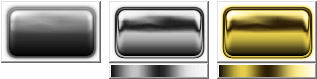
This page is going to describe a procedure which will render the gold button image on the left, using the Filters and Mixers from this site.
When creating something like this it is important to have a distinct target: in this case the target was to reproduce the button described in a Photoshop Glass Button Tutorial.
The button was adjusted to suit a Procedural Textures tutorial by making the button render in four states (highlighted or not, in either Up or Down states).
Noise was added to the reflection and the text ignored. The animation on the right compares the Photoshopped button (with "Button" text) with the image created by the code that follows.
On the Textures page, the creation of procedural textures was introduced.
This page is going to describe a procedure which will render the gold button image on the left, using the Filters and Mixers from this site.
When creating something like this it is important to have a distinct target: in this case the target was to reproduce the button described in a Photoshop Glass Button Tutorial.
The button was adjusted to suit a Procedural Textures tutorial by making the button render in four states (highlighted or not, in either Up or Down states).
Noise was added to the reflection and the text ignored. The animation on the right compares the Photoshopped button (with "Button" text) with the image created by the code that follows.


